Logo AHome
Logo BIndex
Logo CACM Copy

DesbriefTable of Contents


Sensuality in Product Design: a Structured Approach

G.H. Hofmeester
Philips Corporate Design
PO. Box 218
5600 MD Eindhoven
The Netherlands
+31 40 2732302

c896412@nlccmail.snads.philips.nl

J.A.M. Kemp
Philips Research
Institute of Perception Research / IPO
PO. Box 513
5600 MB Eindhoven
The Netherlands

A.C.M. Blankendaal
Delft University of Technology
Faculty of Industrial Design Engineering
Jaffalaan 9
2628 BX Delft
The Netherlands

Abstract

This paper describes a user-centred process for designing a product which induces a sensual feeling. It is assumed that in the design of consumer products feelings are an essential part of human-product interaction. The objective of the graduation project discussed here was to pro-actively design a pager which the target user group (women aged 18-30 years) perceived as sensual.

Users were involved at an early stage of the design process. Based on information gathered in a series of interviews two pagers were designed. In an evaluation both models were perceived as significantly more sensual than a reference model.

Keywords

Sensuality, eroticism, product design, pager, communication, pleasure, emotion, market research, early user involvement.

Introduction

In this paper it is assumed that feelings play an important role in the human-product interaction with consumer products. In this respect, Logan [2], mentions that "for certain product categories such as consumer electronics, an expanded definition of usability is required. This expanded definition includes emotional elements of product design". Nass [3] mentions social behaviour towards computers: users "exhibit behaviours and make attributions toward computers that are nonsensical when applied to computers but appropriate when directed at other humans".

The way users experience interaction with a product has many dimensions. It is assumed that sensuality is one of the positive feelings influencing our perception. Therefore, we think sensuality can play a role in the experience of a product. Since it is assumed that this feeling is positive, it can increase the pleasure involved in using the product. The designer can influence the way feelings are induced by a product. The designer "has powerful abilities to convey complex, non-obvious information using shape and colour" [4].

The method used in this project can help the designer to create a product which induces a particular feeling for a specified target group. This was done by involving potential users at an early stage in the design process and by keeping them involved during the evaluation phase. When used in an iterative process, this early user involvement provides the designer with a tool to monitor feedback on the design as it progresses. Research done at Philips Corporate Design to investigate pleasure in the use of products provided the background for the research methods.

A pager was chosen as a carrier for developing our approach for two reasons:
1. A pager is a device you wear close to your body, and the body is an important factor in relation to sensuality.
2. A pager allows communication with other people. Action and reaction are important aspects of a sensual interaction.
A pager is a portable communication device, which can receive personal messages through radio broadcast. Pagers for personal use are thought to be an emerging market. Form-giving can play an important role in user interface design [4]. In the design of a pager, the product"s shape and colour is seen as part of the interaction design. In a small personal product like a pager, the interaction isn"t limited to the retrieval of messages, but extends to the complete handling of the product and the feelings that are involved in that.

The target group chosen was women aged 18 to 30 years. This group was interesting for two reasons:
1. We were interested in designing for private as opposed to professional use (a younger audience was thought to be more appropriate for this type of use).
2. Women were chosen because current pagers are targeted at a male audience.
Thus, the objective of this project was to design a pager for women aged 18 to 30 years, which induces a sensual feeling. For Philips this was an exploration (it was a graduation project) to learn about how to design products that induce particular emotions.

Sensuality

Literature surveys focusing on the relation between design and sensuality indicated that little information is available about this topic.

Even though sensuality has been described in many ways, a clear definition could not be found in these surveys. Frijda [1] for example, describes sensuality as being charmed or fascinated, being in love, feeling desire, lustful, excited, feeling pleasure and satisfaction. Because there are so many ways of describing sensuality, it was decided not to define this term for the first series of interviews. The subjects in these investigations were presented only with the term "sensuality" (In Dutch the term "erotiek" was used, but this was not translated into the English word "eroticism" because, according to us, "sensuality" comes closer to the Dutch meaning of "erotiek"), thus leaving it open for their own interpretation. The terms that came up in the first series interviews were used to investigate how sensual the final design concepts were perceived to be.

Set-up

Figure 1 shows an overview of the design process. In the exploration phase we interviewed people from the target user group to find product properties which induce a sensual feeling. The results were translated into two design concepts in the design phase. Finally these concepts were evaluated by comparing their sensual properties to a reference model.

Figure 1 Overview of the design process.

phase 1: exploration

A series of interviews was set up to discover which product properties may cause a sensual feeling.

Method

Subjects were twelve women recruited from design schools. It was assumed that designers would have a richer language for describing sensual aspects of products and would be more at ease talking about feelings in relation to products. A disadvantage could be that these subjects are biased compared to the whole target group. Their age varied from 18 to 29. The interviewer was female.

The subjects were asked to bring objects they experienced as being sensual. The interview was divided into two parts. In the first part the subjects were asked to name, as precisely as possible, product properties that could induce a sensual feeling inspired by the objects they brought with them. In the second part of the interview the interviewer explained the functionality of an alphanumerical pager without showing the device or naming it. The subject was asked to imagine a pager that can bring about a sensual feeling. Finally the subjects were asked to rate the properties they had named according to their importance.

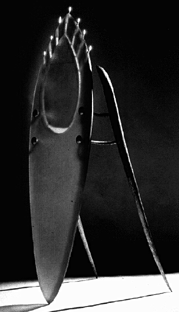
Figure 2 A candelabra that was brought to one of the interviews.

Results and analysis

This paragraph describes the analysed results from the interviews. To be able to give a representation of the interviews that was appropriate for input in the design process, product properties were taken from the transcriptions of the interviews. Some properties were grouped in categories, according to the interpretation of the designer. This analysis resulted in a number of categories of product properties that can induce a sensual feeling according to the subjects. Figure 3 shows a frequency table with the properties that were mentioned most often. Figures 4 and 5 show the results of a rating by the subjects, according to the importance of the properties for a sensual product.


properties                                    frequency

organic, human, body                                 14
smooth                                               13
handsize, fitting comfortably in the hand            12
warmth                                               12
caress, skin close                                   12
flow, swell, rise, expand                            11
nice feeling, protuberance, lumpy, irregular, hole   11
rounding, curve                                      11
soft                                                 10
flexible, malleable, elastic                         10
pleasure, nice, enjoying                              6
wearing on the chest                                  7
wearing in the pocket                                 5

Figure 3 The properties causing a sensual feeling that were most often mentioned. The right column shows the number of times the properties from that category were mentioned in all the interviews.


objects                                           score

soft                                                 74
caress, skin close                                   55
smooth                                               54
slope, slightly curved, firm line, thick-thin        47
rounding, curve                                      46
shiny, glossy, reflection                            35
flexible, malleable, elastic                         34
warmth                                               31
heavy, sagged shape                                  26
contrast in colour                                   23

Figure 4 The 10 object properties causing a sensual feeling that were rated highest. Score refers to the total sum of the ratings. The ratings per property range from 12 to 1 (12 for the most important).


pager                                             score

organic, human, body                                 54
warmth                                               54
wearing on the chest                                 53
handsize, fitting comfortably in the hand            48
smooth                                               40
hard                                                 34
heavy, sagged shape                                  32
flow, swell, rise, expand                            30
nice feeling, protuberance, lumpy, irregular, hole   29
warm light colour, red                               24

Figure 5 The 10 pager properties causing a sensual feeling that were rated highest. Score refers to the total sum of the ratings.

Because "sensuality" can be seen in so many different ways, it was necessary to form groups of properties that indicate different preferences. To indicate this differentiation a correspondence analysis was performed on the data. The analysis produced three factors. Factors can be seen as axises in a 3-dimensional space in which all the properties are mapped (figure 6). The properties that all the subjects thought to be important are in the middle. The more extreme properties have more distance from the centre. We defined each of the factors by two clusters of properties that represent the extremes of each factor. Thus this analysis resulted in three pairs of clusters of product properties (figure 7).

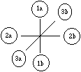
Figure 6 The six clusters of product properties in the 3-dimensional space.


cluster 1a                                    cluster 1b

- vibration                                   - wearing on the arm
- flexible, malleable, elastic                - slope, slightly curved, firm line, thick-thin
- caress, skin close                          - flow, swell, rise, expand
- soft                                        - shiny, glossy, reflection
- handsize, fitting comfortably in the hand

cluster 2a                                    cluster 2b

- flow, swell, rise, expand                   - heavy, sagged shape
- wearing on the chest                        - fabric, satin, plush, velvet
- inwards, alone                              - scent
- secretly, mysterious, unnoticeable          - warmth

cluster 3a                                    cluster 3b

- wearing on the arm                          - countersunk keys
- wearing on the neck                         - slope, slightly curved, firm line, thick-thin
- nice feeling, protuberance, lumpy,          - warm light colours, red
  irregular, hole                             - shiny, glossy, reflection
                                              - scent
                                              - rounding, curve

Figure 7 The properties that form the three pairs of clusters.

Conclusions

A brief representation of the results of the interview was needed as starting point for the design process. This was done in two categories: "basic" properties and "extreme" properties. For "basic" the six properties with the highest ratings were chosen from the tables in figures 3 and 4. These were:
- Organic, human, body
- Warm
- Smooth
- Soft
- Touch, skin close
- Wearing on the chest
For "extreme" the six clusters from the correspondence analysis were used. The "basic" properties represent elements that always have to be in the design for a sensual pager. The "extreme" properties represent different preferences that different groups of users might have.

In this phase of the design process the definition of "sensuality" proved to be a major obstacle. It is hard to explain this concept to subjects without being too specific.

Phase II: design

In this phase the results from the interviews were translated into collages. The collages, the "basic" and "extreme" properties and the transcriptions from the interviews were used as design input. Two design concepts were created.

Twelve collages were made. They represent the six "basic and six "extreme" elements mentioned in the previous paragraph. Input for the collages were the transcriptions of the interviews and the objects the subjects brought with them. The goal was to make the results of the interviews more appropriate for design input by defining atmosphere, colours, shapes, textures and materials. The collages were boards (100x70 centimetres) with full colour images of the objects the subjects brought and images, 3-dimensional shapes and materials the designer related to the properties mentioned.

One factor, representing two pairs of clusters, that seemed to be most appropriate for developing two different concepts, was chosen. This was factor 2 (see figure 7). Two designs were developed on the basis of the two collages of that factor. The collages of the six "basic" properties were used as a reference.

Description of the "Basic" Properties

The comments the subjects made in the interviews concerning these "basic" properties are described below.

Organic, Human, Body

Most of the subjects mentioned organic shapes. According to them, these refer to body shapes. This "human side" of a pager is associated with intimacy. One of the subjects related organic shapes with a "female feeling". Organic can mean that the shape has protrusions which are interesting to play with. The transitions from one shape to another should never be sharp though. It can also mean that the shape is convex, or bulging.

Warmth

The colour red was mentioned in the interviews as sensual, because it suggests warmth and that makes you feel good. Fabric was seen as a warm material. Several subjects said the pager should be at body (or skin) temperature, but not be sweaty (This was said in combination with wearing the pager close to your body).

Smooth

The surface should be smooth, but also have some texture. The surface should be nice to run your finger over. Surfaces that were mentioned in this respect were: skin, fabric, chestnut skin, the surface of a shell and wood.

Soft

According to the subjects, softness refers to giving way of the surface or to the structure of the surface itself. When the surface can give way a little, it should not be too flexible. When the surface always returns to it"s original shape, it was associated with skin. It makes an object nice to play with, when you can pinch it a little. Soft flexible rubber and velvet were mentioned in this context. When the surface itself is soft, it makes one want to touch it. This was associated with skin. The skin of a peach was mentioned in this context. A surface that is smooth and warm or a matte surface was also experienced as soft.

Touch, skin close

The shape should invite one to touch, by fitting close to the hand, so that the fingers fit around it. There should be different ways to hold the device. The shape should be round, with smooth transitions, like a body, so that when you run over the surface with your finger, it is "enjoyable without interruption". The device should be worn close to the body. Touching can be more interesting, or exciting, when your finger sometimes feels a little bump in the surface. It is also exciting when you almost don"t feel the touch of the surface on your hand, like when you move your fingertips over the palm of your hand. One of the subjects mentioned that something could happen when you touch certain spots on the surface. These spots should not be obvious. She thought it was an exciting idea that you are the only one who knows how the device works. You must be able to play with the device, finger it, for instance when it is in your pocket. The device can also be malleable. Pinching and massaging is associated with sensuality. The shape could grow when a message comes in or a key could move outward. When the device is worn in the pocket, the user will be the only one who feels the device pushing against her skin.

Wearing on the chest

Several subjects mentioned wearing on the chest as the most sensual place. It was seen as a nice place, it is easy to touch the device whenever you want. It was also seen as a hidden and special place.

Design Concept 1

This design is based on the cluster from factor 2 that includes the properties "flow, swell, rise, expand", "wearing on the chest", "inwards, alone" and "secretly, mysterious, unnoticeable". Figure 8 shows an image of the collage.

On the basis of these properties and the collages a design was developed. Following is a description of the "extreme" properties and a description of the design. Figure 9 shows a picture of the resulting design.

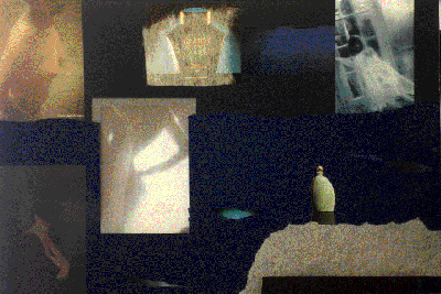
Figure 8 The collage for cluster 2a (design concept 1).

Description of the "Extreme" Properties of Concept 1

In this paragraph the comments by the subjects for the properties from cluster 2a are described. The property "wearing on the chest" is described in the previous paragraph.

Flow, Swell, Rise, Expand

One subject in the interviews mentioned the subtle rising of a Citroen car when it is started. This is an almost unnoticeable motion. For a pager this could be translated in the pager slowly starting to glow when a message is detected, like a "cloud of ink spreads in water". It could also slowly change colour, like "milk in your coffee". Other subjects mentioned the pager becoming warmer and lighting up, like "a subtle glittering". A sensual pager should be "intimate, calm and slow".

Inwards, Alone

Intimacy was often mentioned in relation to sensuality. The pager should be small, implying that it is only for the owner. Wearing on the chest relates to this. The device should be inconspicuous. When other people are around, they shouldn"t notice the pager. According to one of the subjects, a sensual feeling lets you forget everything for a little while, distracts you from what you were doing. The user should be the only one who notices the alert signal, when a message is detected. The signal could be a whispering sound or a soft vibration, as long as other people are not disturbed.

Secret, Mysterious, Unnoticeable

Several subjects mentioned semi-transparency. "You want to see what it is, but you can"t." This was compared with semi-transparent clothing. Because of the vagueness of the details, everything seems to be more beautiful. It can be exciting when the pager is hidden. One subject mentioned that the pager could beat like a heart, allowing only the user to feel it. Another subject mentioned that the user should be the only one who can see or hear the message.

Description of Design Concept 1

The device measures 70x45x20 millimetres. It is shaped in the form of a drop, with a hole going though it on an angle. The shape of the pager and the hole, make it possible to wear it on the chest, like a pendant. It is made out of plastic, which is semi-transparent. The colour is blue. The finish is a matte soft-touch paint. The parting line, going all around the side of the product, is filled with a silicon rubber. The controls are a small high-gloss metal key on the front, which feels like a little bump on the surface, and two touch areas on the back. The touch-areas are distinguishable because they are slightly sunken into the surface. The output is formed by six symbols and twelve digits. These are light images that are projected on the front surface of the product. When they are not lit, they are almost invisible.

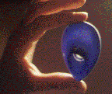
Figure 9 Design concept 1.

When a message is received, the device slowly starts to glow. The user can activate the pager by pressing the metal key on the front of the device. Subsequently, several symbols and numbers will appear on the surface of the pager, depending on the content of the message.

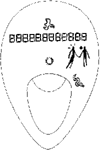
Figure 10 Front view of design concept 1 including the six graphic symbols and twelve digits.

Figure 10 shows the graphic symbols that can represent a message. There are six symbols:
- a bird, which can represent positive, affirmative or happy
- a snake, which can represent negative, or sad
- two human figures, which can light up separately or together, which can represent alone or together, you or me
- a heart, which can represent feeling or leisure
- some lines, which can represent thinking or business.
These symbols are not pretending to be universal, they present an exploration of a non-verbal interface. The user can give them meaning by the way she uses them, the presented meanings are a suggestion from the designer. In addition to these symbols a 12-digit number can be displayed, representing for instance a telephone number or a time for a suggested appointment. By combining these symbols, messages can be composed. For instance, the bird, the two human figures, the heart and a telephone number can mean something like "me and you, happy feeling", or it can mean "Can you call me back to make an appointment in our free time?". In this way, the sender is given the possibility to convey messages with an emotional character and gives the sender the opportunity to use his or her creativity more, compared to a purely numeric interface. The user can scroll through the messages in the memory of the pager by moving her finger over one of the touch areas on the back of the pager. The other touch area can be used to set the alert signals.

Figure 11 The display on design concept 1.

Design Rationale for Concept 1

The organic shape (including the hole) of the pager refers to the body. The curved lines create a tension, which was often mentioned in the interviews. The symbols used in the display enhance this organic character (see figure 11).

The finish of the pager is a soft-touch paint. Stroking the device as a way of scrolling instead of clicking a key, is a way of trying to enhance this softness.

The alert signal, a light which rises slowly to a maximum, is a characteristic emphasising the "flowing" transition. The glowing of the alert light suggests warmth.

The pager normally hangs upside down on the cord. When the user wants to see the messages, she is likely to hold it in the cup of her hand, close to her. This emphasises an atmosphere of intimacy, relating to "inward, alone". The user can wear the pager close to her body, making it a very personal device. It can be further personalised by using a cord or ribbon to hang the pager on. The pager fits smoothly in the hand of the user, making it personal and also enabling the user to "forget the outside world". The symbols used in the display make it possible to communicate personal messages.

Semi-transparency and a blue colour emphasise the aspect of mystery, according to the subjects. The display is hardly visible when the device is not active. Only the user will know the device is activated by touching the small metal button on the front. The messages, which appear as symbols on the surface of the device, have a meaning connected to the person sending them. They don"t have a prescribed meaning. Because of this, the sender and the user will be the only people able to understand the message.

Design Concept 2

The second design concept is based on the properties "heavy, bulging shape", "fabric, satin, plush, velvet", "scent" and "warmth". A part of the collage made on the basis of these properties, is shown below (figure 12).

Figure 12 The collage for factor 2b (design concept 2).

Description of the "Extreme" Properties of Concept 2

Heavy Bulging Shape

Most of the subjects who were interviewed, mentioned that the pager should have round convex shapes. A heavy, bulging shape would be "peaceful"; "you can give yourself to it, without thinking you will break it".

Fabric

Several subjects mentioned fabric being a warm, soft and strong material. It feels nice to touch it. The temperature also feels nice, it immediately has your skin temperature. Fabric was associated with skin. The gloss of fabric can be attractive. The soft surface can tickle, and it makes you want to touch it. The combination of softness and strength was seen as sensual; it takes some force to push in a soft fabric. The property "warmth" is described in the beginning of this chapter. Scent was not addressed in this concept, because it was technically not feasible.

Description of the Design

This device measures 65x45x35 millimetres. It is wedge-shaped, bulging. A hard plastic casing, containing the electronic parts, is covered by a silicon rubber coating. The colour is dark red. The silicon coating encloses a silicon gel. Because of the gel filling, the coating is under tension. The coating can be pushed in a few millimetres. The shape is malleable but, because of the tension it will always return to its original form. The device has a fabric cover. One side of the device has a hard plastic finishing. This part has holes to let the sound from the loudspeaker out. The device has a small triangular black joystick. When a message is detected by the pager, the joystick moves out slowly. The joystick can then be used to step through the messages and to set the alert signal.

The pager can be clipped to clothes or worn in the pocket or a bag. The gel layer around the hard casing, allows the temperature of the pager to change. The little joystick will move out when a message is detected. It will push against the user"s skin, if the pager is worn on the body. The joystick is used to step through the messages and to select the alert signal.

Figure 13 Design concept 2 with a fabric cover with a zipper..

The interface is auditory, there is no visual display. Basically, it has the same principle as the interface described in concept 1. The graphical icons are replaced by auditory icons, and the twelve digits are replaced by spoken numbers. The auditory icons are based on three instruments: - a clarinet, which is a neutral sound in this case - a cello, representing sad or negative - a flute, representing happy or affirmative. These instruments are played in ascending or descending tones, representing respectively "you" and "me". The sounds can be modified, representing "business" and "leisure". To be able to hear the messages, the user has to hold the pager close to her ear. Other people won"t be able to hear the sounds.

Design Rationale for Concept 2

The organic shape of the pager is bulging, which was mentioned by some of the subjects as being sensual. The joystick can function as a playful element, referring to the protrusions some subjects mentioned.

The silicon gel can store and dissipate warmth. When it has not been worn for some time, the pager will feel cold. When wearing it, the pager will become warm and stay warm for some time. This refers to the pager being at body temperature, which was mentioned by several subjects. The colour of the pager is dark red, which was mentioned as a warm and sensual colour.

The pager is covered by fabric, referring to the smooth and skin-like qualities mentioned in the interviews. The cover is made out of two different fabrics, with different textures, making it more interesting to feel. Softness in this pager is a combination of giving way of the surface and a soft surface texture. The gel has the skin-like qualities that were mentioned in the interviews.

The whole pager is designed to be an object that is interesting to touch and play with. The silicon coating, filled with gel, gives it a heavy, bulging shape. The joystick, used as an input method, also has a more sturdy character then the keys that are normally used on pagers. To give the pager a finish which provides a good tactile sensation, it has a fabric cover. This cover can also be used to customise the device; many kinds of fabric can be used.

phase 3: Evaluation

The objective of the evaluation was twofold:
1 To investigate whether the designed pagers would induce a sensual feeling.
2 To find out if the clusters from the correspondence analysis were related to the concept designs that were designed on the basis of those clusters.

Method

Subjects were 27 women, aged 18-30. The subjects from the first series of interviews were not part of this group, because they were already biased. The stimuli in this evaluation study were the two concept pager models and a reference pager model (an alphanumerical pager, called "The Informer") currently available on the consumer market, but originally designed for professional use. Because no interactive prototypes were available for the design concepts, hard models served as test objects. The reference pager was also represented by a hard model, to pursue an equal level of detail. The subjects were asked to rate the models on semantic differential scales, using the properties derived from the interviews.

An instruction sheet explained the set-up of the study and the kind of models that were evaluated. An interviewer introduced the subject and explained how the semantic differentials should be used. Each subject then read a short explanation about what pagers are. Each pager was accompanied by another sheet, explaining the user interface. The pagers were then rated one by one in a random order. A short debriefing ended the session.

Results

The results from the evaluation study are shown in figures 14, 15 and 16. These figures are graphical profiles showing the means of the scores per item.

Figure 14 The means for the semantic differentials referring to sensuality.

Figure 15 The means for the semantic differentials referring to cluster 2a (design concept 1).

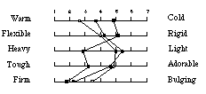
Figure 16 The means for the semantic differentials referring to cluster 2b (design concept 2b).

Conclusions from the Evaluation Study

In the group with general sensual properties (figure 14) a clear distinction is visible between design concept 1 and design concept 2 on the one side and the reference model on the other. The two concept designs were rated significantly higher on the terms "erotic", "sensual", "organic", "strokable", "soft" and "warm" than the reference model (a t-test was performed on the results). Two terms are rated differently from what was expected: concept 1 was perceived as significantly more "attractive" than both concept 2 and the reference model. Concerning the item "smooth" only concept 1 and concept 2 were perceived significantly different, concept 1 was seen as smoother. In the two categories where we expected a distinction between two concept designs (figures 15 and 16), the difference is less obvious. Four of the six items attributed to concept 1 show a significant distinction between the two models. Two of them, "firm" and "smooth", show the anticipated result. The results for the items "secret" and "introvert" however are reversed from the expected result. For the items attributed to concept 2, two out of five show the expected result significantly; "soft" and "bulging".

Figure 17 The user has to hold the pager close to her ear to hear the messages.

Conclusions and Discussion

The objective of this project was to design a product that induces a sensual feeling. The resulting designs were perceived as significantly more sensual than a reference model.

Further conclusions from this project are divided into two areas: the process for designing a product that can induce a sensual feeling and observations about the designs.

Process

There are a number of factors that were essential for the process. The interviews were useful for gathering information about product properties. They also gave clues for the relative importance of these properties. Secondly, collages were necessary to make the step from the results of the interviews, which were mainly verbal, to the design phase. Finally the intuition of the designer played an important role. The results of the interviews had to be interpreted. The designer carried out this interpretation. It is impossible to conceive a basic form for the design without this subjective interpretation of the results.

Using semantic differentials, quick investigations can be conducted to obtain an overview of the rate of success in regard to the items that were used as input for the product design. Only small subject samples are needed to obtain significant results.

Design

The user interface was designed to enable the sender of a message to express feelings in a non-verbal way. Because of the spontaneous development of Emoticons, typographic symbols used in E-mail communication, it is assumed there is a need to communicate messages with an emotional content. The user interface has to be tested however to deter-mine its possibilities. The user interface in concept 1 shows the possibilities of integrating a display and controls in a product in a way that is more integrated in the whole product concept than currently used LCD"s and keys. The user interface in concept 2 shows an example of an auditory interface, which uses the same symbolic language. This approach also needs to be evaluated.

Design processes and evaluations are often visually oriented. From the results of the interviews, it can be concluded that attention should be given to tactile and auditory qualities of products to make a design complete and coherent .

Lessons Learned

A process like the one presented in this report can support design decisions related to the feelings that are induced by a consumer product. It is important for a company like Philips, that is changing to become more consumer oriented, to take feelings induced by design seriously. An additional advantage is that new product designs can be created by understanding the needs of potential users and their feelings, rather than starting from on technical innovation. New kinds of products might evolve from such a process.

Involving users at an early stage of the process can increase the chance that consumer products will induce particular feelings for their users. It can clarify and deepen design briefs, so that a commissioner can define what he wants in a better way and the designer has a broad range of information and input regarding users and their feelings. To fully use this user input, the process of investigation and design should be iterative.

(The design models are protected and the user interface is patented.)

References

1. Frijda, N. H. De Emoties. De Psycholoog. (July, 1993), 278-284.

2. Logan, Robert J., Augaitis, S. & Renk, T. Design of Simplified Television Remote Controls: a Case for Behavioral and Emotional Usability, in Proc. Human Factors and Ergonomics Society (1994), 365-369.

3. Nass, C., Steuer, J. & Tauber, Ellen R. Computers are Social Actors, in Proc. Chi"94 Human Factors in Computing Systems (Boston, April 24-28, 1994) ACM Press, 72-78.

4. Smets, G., Overbeeke K. & Gaver, W. Formgiving: expressing the Nonobvious, in Proc. Chi"94 Human Factors in Computing Systems (Boston, April 24-28, 1994) ACM Press, 79-84.